Project 9

  • Portfolio (Scribd.com):
  • Project Corrections / Time spent:
    •  35 min fixing the flier
      • changing colors, removing gradients, adding more boxes, re-sizing and moving logo, shifting text to create better hierarchy
    • 5 min editing the event ad
      • moving the title upwards more, shrinking the goldfish symbol, shifting text a few pixels
    • 30 min re-sizing the website
      • removing extra images to fit the whole webpage easier on the screen, playing around with the zoom to try and find the best quality screen shot and keep the whole static background intact
    • 50 min adding and tweaking the other logos
      • reshaping parts of the second logo to look less like a wolf and more like a fox, shifting of sound waves behind the first logo to remove trapped white space next to the tail


  • Message: I have the skills needed to design logos, fliers, brochures, websites, and to edit photos as well.
  • Audience: Potential employers
  • Top Thing Learned: A simple, unified approach to designing a portfolio really helps the contents stand out and it comes across professional.
  • Future application of Visual Media: An at home design commissioning business, meeting any visual need for future clients.
  • Color scheme and color names: Monochromatic Blue
  • Title Font Name & Category: Maeninaja; Decorative
  • Copy Font Name & Category:Urban Elegance; sans-serif

Project 8

Front:

FRONT

Inside:

INSIDE

Back:

BACK

Video Overview:


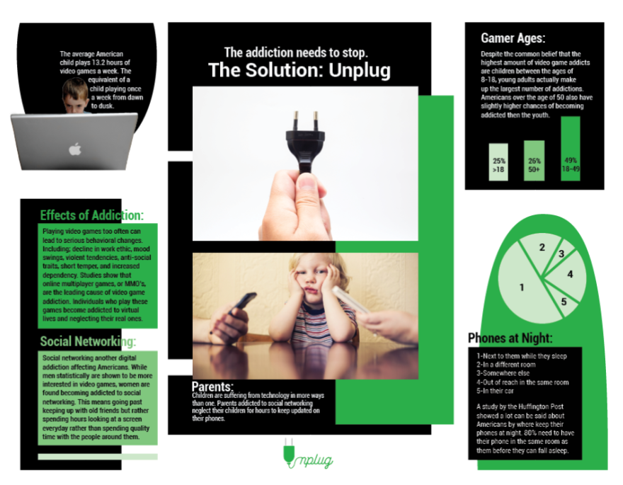
  1. Description: An informational pamphlet to warn anyone about the types, symptoms, and results of video game addiction with a simple proposed solution. Unplug.
  2. Process (Programs, Tools, Skills): The layout of the brochure was created on Adobe Indesign. The picture on the back of the brochure was edited in Adobe Photoshop to remove the original red color and replace it with a green that complements the design. A boy and a computer in a picture were cropped out in Photoshop to allow a more dramatic text wrap found on the inside upper left corner of the brochure. The logo was created with Adobe Illustrator, based off the idea of a plug and its cord winding to make the rest of the word ‘Unplug’. Each paragraph style shown on the pamphlet is repeated at least once more somewhere else. This was done using the Paragraph Style tool in InDesign.
  3. Message: Unplug from too much technology use.
  4. Audience: Anyone feeling they might use technology too much.
  5. Top Thing Learned: How to format a brochure, a double sided and folding flyer, on InDesign.
  6. Color scheme and color names: Monochromatic Green
  7. Title Font Name & Category: (Found in Logo) Wasted; Script
  8. Copy Font Name & Category: Roboto (varying weights); sans-serif
  9. Word Count of copy: 302
  10. Thumbnails of Images used:

Plug

distracted-parents
Distracted parents

ControllerKid

Sources:

http://www.rainpartners.com/digital-detox-do-you-take-the-time-to-unplug/

http://micheleborba.com/blog/parents-too-plugged-in-kids-weigh-in/

(Unsplash Photos)

http://drmartinfletcher.com/2010/07/05/fat-and-stupid-is-no-way-to-go-through-life/

Project 7

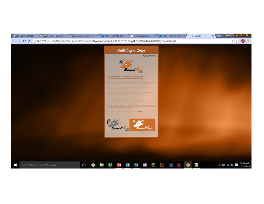
Screenshot

  1. Description: A Webpage displaying a logo created earlier with detailed steps outlining how it was made.
  2. Process (Programs, Tools, Skills):HTML and CSS code sheets were linked together to create this webpage. Extensive hours were put into formatting the code to make the web page visually appealing and complementary to the logo being displayed. The background was formatted to stay the same shape and size no matter the screen size or how far zoomed in/out the webpage might be. The image is zoomed out to show the whole page, but naturally is far more legible.
  3. Message: What design elements are needed to make a logo
  4. Audience: People curious on how the logo was created
  5. Top Thing Learned: Coding is a very tricky process and requires dedication and perfection in order to be done right.
  6. Color scheme and color hex(s): Monochromatic Orange. #000, #FFF, #ca6c29, and #a35524
  7. Title Font Families & Category: Leckerli One, Script
  8. Copy Font Families & Category: Helvetica, Sans-Serif
  9. Changes made to the CSS: A static background image, matching font colors, fonts that match as closely as possible to those used in the logo, enhanced padding to space the objects on the page, a note added that doesn’t affect the code, and additional smaller formatting to make the elements flow on the page.
  10. Word Count: 278

Project 6

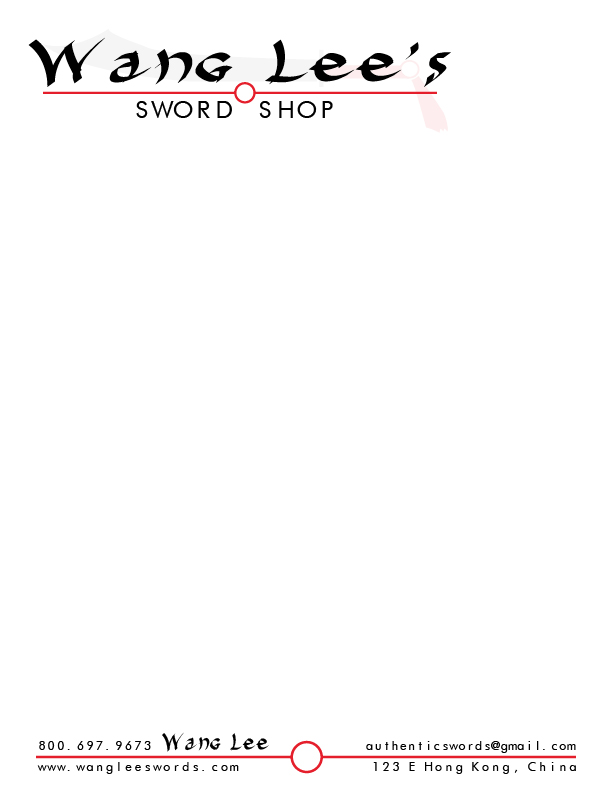
Letterhead:

P6 Letterhead-Kaytlin Richards

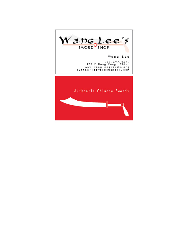
Business Card:

Business Card-01

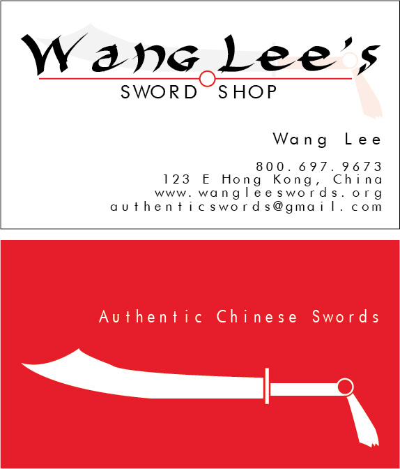
Business Card Enlarged:

P6 Business Card Enlarged-Kaytlin Richards

  1. Description: Stationery for a traditional Chinese sword making company.
  2. Process (Programs, Tools, Skills): The original logo design was made on Adobe Illustrator. The sword is based off the traditional look of the Chinese sword Dao. The line with the circle was made to tie in the unique hilt piece of the sword. After the logo was created, it was integrated into a business card, also on Illustrator. The red side of the business card is imagined with a slightly rougher texture on the red parts and a shiny and smooth surface for the white sword and text. Afterwards, all the information and the logo was transferred to an Adobe InDesign document where the letterhead was created. The entire process required meticulous attention to alignment and rearranging items till the flow was ideal.
  3. Message: A company sells traditional Chinese Swords.
  4. Audience: Anyone interested in Chinese weaponry.
  5. Top Thing Learned: The positioning of the background sword watermark had to be just perfect in order to make the flow of the image work.
  6. Color scheme and color names: Monochromatic red.
  7. Title Font Name & Category: Harakiri Medium, script
  8. Copy Font Name & Category: Futurist Fixed-width, sans serif

Project 5

Kaytlin-Richards-P5logos

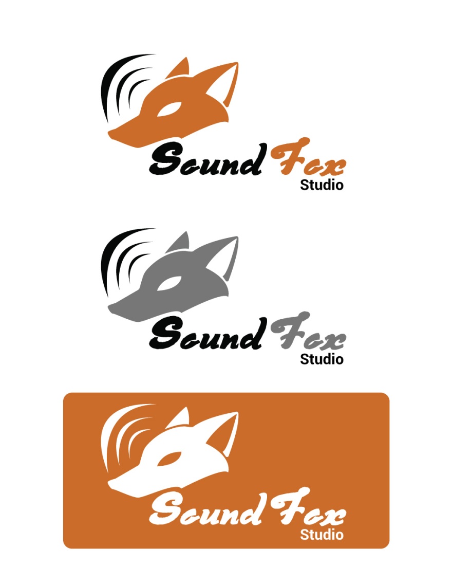
  1. Description: A logo for a sound studio company which features a fox for a mascot. Minimalist and bold to draw the eye.
  2. Process (Programs, Tools, Skills): Made entirely in Adobe Illustrator. Each part of the image was made using the pen tool. Edits were made to the shape in order to refine the fox look by using the direct select tool. The sound waves are in direct proportion to each other, the smaller once being copied from the first. The color is streamline throughout thanks to the eye dropper too.
  3. Message: A bold company that specializes in music studio productions.
  4. Audience:Musicians or composers looking to find a studio to record their music.
  5. Top Thing Learned: The pen tool’s powers. I have learned how to create practically any shape using the pen tool in a short amount of time.
  6. Color Scheme and Color Names: Monochromatic Orange
  7. Title / Body Font Names & Categories: Title: Derniere Script, Script          Body: Roboto Bold, Sans Serif

Project 4

P4-Final

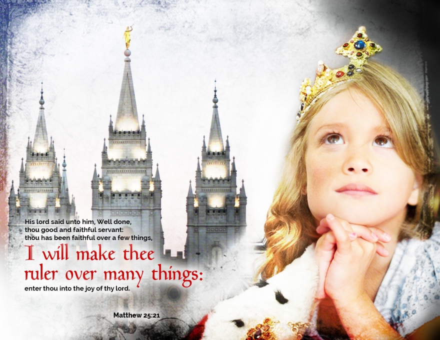
  1. Description: This is a montage of six images, using multiple layer masks and filters. The girl off to the right is actually two different people, a grown woman dressed as a queen and a little girl praying, symbolizing what the little girl will be when she grows up.
  2. Process (Programs, Tools, Skills, Steps taken while designing): Photoshop: blending photos together to create a seamless, single image. Each photo added one at a time and enhanced, then masked to blend in with the others.
  3. Message: Those who are faithful will be made rulers.
  4. Audience: People who consider themselves to be generally faithful people.
  5. Top Thing Learned: Having more than three images to try and mask together is a real time consumer.
  6. Filter / Colorization used and where it was applied: Saturation was used on both pictures of the girl and on the angel Moroni in the temple. It had to be masked to only certain areas (like the girls’ hair wherever they didn’t match in color). The Angel had his golden tone tuned a little bit to match the gold of the crown.
  7. Color scheme and color names: Triad: Yellow, Blue, Red
  8. Title Font Name & Category: Goudy Medieval: Decorative
  9. Copy Font Name & Category: Raleway: Sans Serif
  10. Thumbnails of Images used:

GirlSymbol

QueenTemple2

Borderborder3

Sources (Links to images on original websites / with title of site):

The Church of Jesus Christ of Latter-Day Saints

clker.com

The Location Guide

The Church of Jesus Christ of Latter-Day Saints

Deviant Art

Clip Art Best

Project 3

P3 Design Final

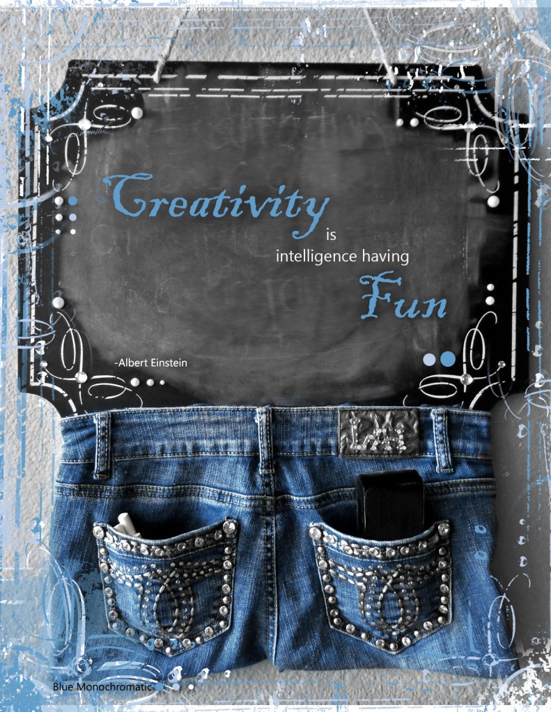
  1. Description: With this project I worried less about a phenomenal photo and more on getting a decent quality shot, editing to make it look more appealing without taking away from the natural image, and designing around that photo to create a unified yet dignified design.It is supposed to simply appeal to the viewer,not to get across any particular theme or idea other then creativity. All work is original.
  2. Process (Programs, Tools, Skills, FOCUS principles):First started with a simple digital Sony Cyber-Shot camera and the random wall hanging my roommate had in the living room. Using the dusty, yellow lit image, I fixed it up on Photoshop with basic editing functions. The fun part was pulling out the swirling design on the board and changing the colors to create a unified border on the edges. This utilizes repetition, seeing that the curves and circles are repeated throughout the image, and color with the emphasis on the color blue for its soothing and pleasing mood.
  3. Message: I have the skill and creativity needed for this position.
  4. Audience: Potential Employer
  5. Top Thing Learned: Sometimes over doing it is easy to do. When I first made the border the top left corner had thousands of white specks which were to noisy and detracted from the rest of the project. Despite their appeal, I had to erase them from the image in order to keep the attention on the board.
  6. Color scheme and color names: Blue Monochromatic
  7. Title Font Name & Category: Blackadder ITC Regular
  8. Copy Font Name & Category: Nirmala UI Regular
  9. Thumbnail of original, unedited image inserted                                                              DSC01061
  10. Date and location you took the photo                                                                              10/14/15 In my apartment living room.

P3 Activity

Light 1: Outside
Light 1: Outside
Light 2 – Inside
Light 2 – Inside
Focus 1 – Foreground
Focus 2 – Background
Composition 1 – Thirds
Composition 2 – Lead Room

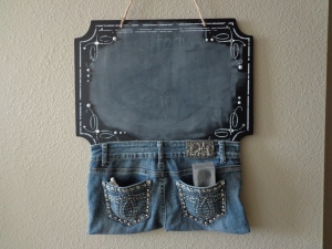
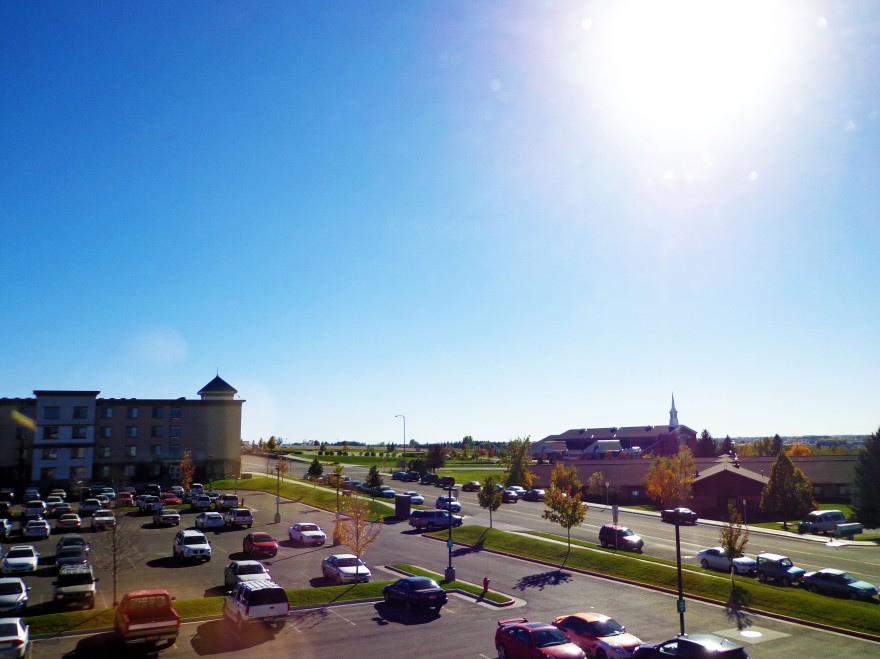
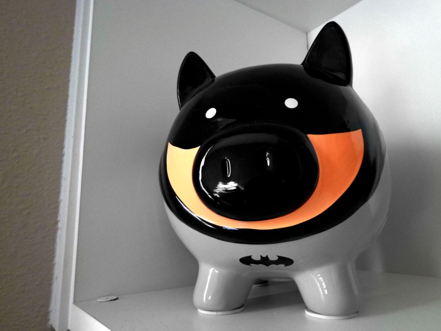
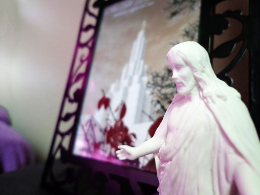
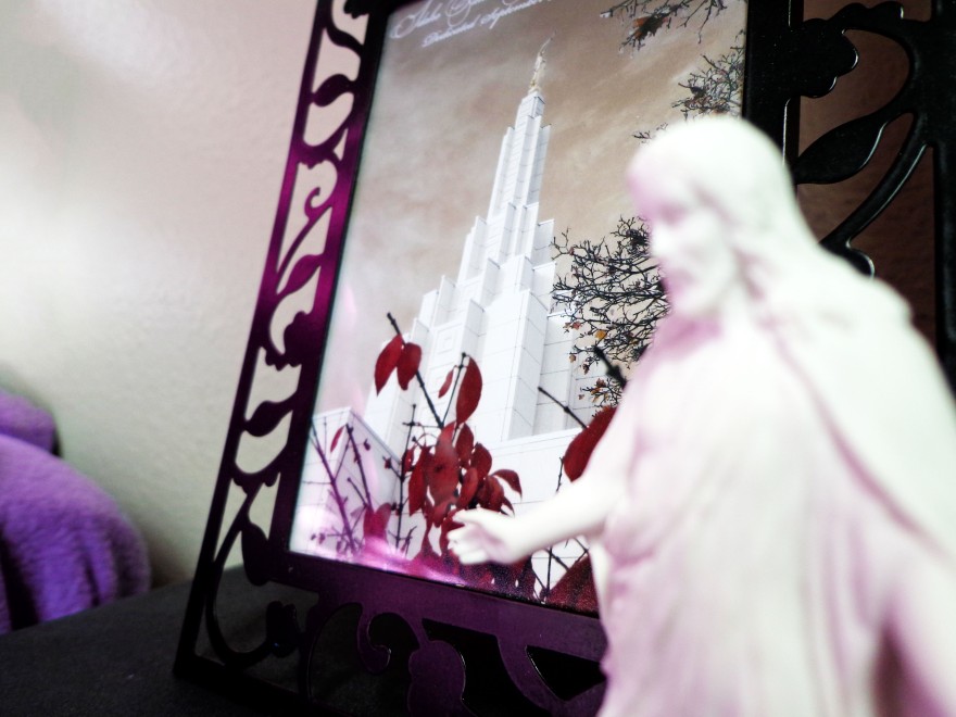
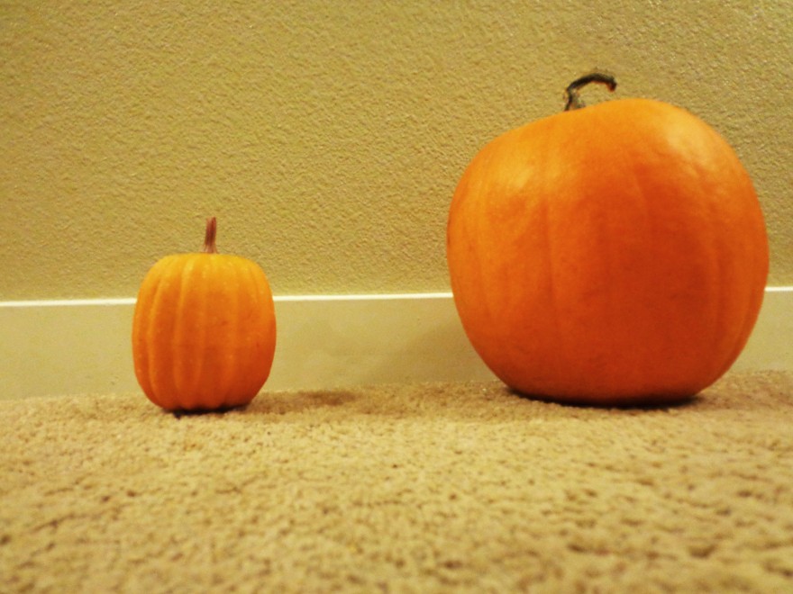
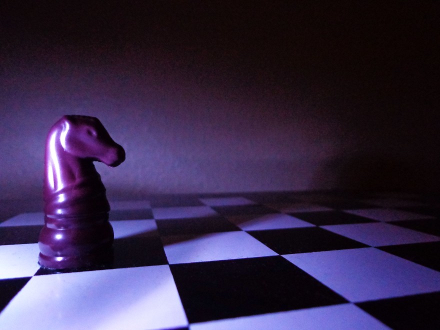
With all the freedom to choose subjects, I decided to pick things I had just lying around my room or things I could view from my window, giving these six images a connection. (Even if it is a stretched one). I really enjoyed toying with the lighting and trying to get the light source to play an important part in the mood for the pictures in a couple of the photos. The others I would try to add a specific color scheme or idea to.

The Lead Room photo gave me a little heartache because I had a very specific image of what I wanted the lighting to look like before I started. Unlike other ideas, I was adamant about getting this one to work. I probably took twenty photos and played with the lights/flashlights to get the photo posted here, and while the lighting is what I want, the quality of the photo is still lacking a bit. Oh well, I will work with what I have got.

Project 2

P1 Final-Kaytlin Richards

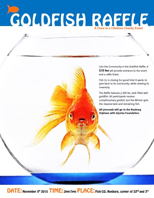
Description: To catch the viewers attention, the goldfish was placed in the center with the colors vibrant enough to draw the eye. Once the viewer looks at the fish they will then notice the bold title at the top, bringing their attention quickly to the subject of the poster. The orange tagline below the title informs them the purpose is for Charity. This will cause the viewer to wonder what goldfish have to do with charity and they will move onto the text next. At the bottom, bolded so the reader won’t skip over it, is the date, time, and place.

  1. Process (Programs, Tools, Skills, FOCUS principles):Done in Microsoft Word; utilizing shape tools, text boxes, and a scanned image; required many hours of layering to get the shapes to lay where they should; this poster also focuses more on color (using a complimentary scheme with orange and blue) to appeal to a wide variety of audiences and to draw attention with the bold colors. It also plays with shape, having the orange goldfish symbol appear to be swimming in the blue shape behind the title text.
  2. Message: The main idea for this poster would be to inform the public off a closing business that would like to use the last of its stock to raise money for a local charity. The Goldfish Raffle is the main feature of their event, making it their focus.
  3. Audience: The local public, of all ages.
  4. Color scheme and color names: Complimentary colors; Blue and Orange
  5. Top Thing Learned: I learned that Microsoft Word is a very picky program to work with, and it never lets you format the way you first envisioned, so I had to be flexible with my approach to the project. I also learned that printing multiple times is necessary because the print preview is almost always off in comparison to what will actually be printed.
  6. Title Font Name & Category: Hobo Std. Decorative
  7. Copy Font Name & Category: Leelawadee UI. Sans Serif
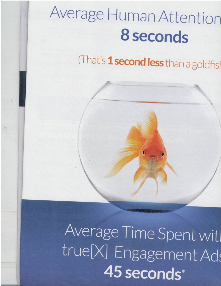
  8. Scanned images used, sources, original sizes, location of scanner used:                 Found in the Advertisement Age magazine, vol. 87 issue 14. The picture was about 5.5″ long by 7″ wide in its original source. Was scanned in the David O. McKay Library. Original Photo:

GoldfishScan

Resume

Kaytlin Richards

731 Ensign Drive~   Ammon, Idaho 83406~   (208) 534-8332~   ric15004@byui.edu

Objective: To find entry level design employment or internship.

GPA: 3.953            Education: Hillcrest High School 2011- June 2015          ACT: 27

                               Brigham Young University-Idaho September 2015-

Degree Classes: Introduction to Communications/Writing for Communications Career/ Visual Communications

AP Classes: Literature and Composition/American History/ Pre-Calculus/ American Government/ Calculus/ Language and Composition

Notable Extracurricular: Artist Education Levels I,II,IV/ Digital Graphics and Media I, II/                         Journalism and Publishing  years 2010-2011 and 2014-2015

Activities and Awards

Excalibur Staff                                                                                                                                          2014-2015

                      Hillcrest High School’s yearbook team. Each member expected to design eight spreads for the yearbook, edit the pictures they use, set up and interview student body members, donate out of class hours, manage difficult priorities, meet deadlines, understand and use advance camera equipment, and equally cover all aspects of school life.

Inklings Creative Writing Club                                                                                                                                                                                                                         2011-2015

Four years of designing plot, coordinating actions, demonstrating writing abilities, providing and accepting constructive criticism for the goal of a completed group work. Two years of which served as leader and organized all club proceedings.

STEM-TO-STEAM                                                                                                                                                                                                                                   Feb 19-28, 2014

Idaho’s state wide competitive art display for works featuring futuristic or technical themes. Received Honorable Mention.

High Honor Roll                                                                                                                                                                                                                                      Years 2011-2013

Academic highlighting of accomplished students. Have received previous three years.

Leadership/Work Experiences

4/21/2014 to 9/3/2015

Worked as a Library Page for the Idaho Falls Public Library: sorting literary works in their correct places; directing, recommending, and aiding patrons; and helping maintain a productive environment for coworkers and the public.

2013-2015

Served as the President of the Inklings Creative Writing Club: organizing, planning, cooperating, motivating, and improving both club proceedings and club members in their abilities.

Late April 2014

Organized a book drive for the Knighthouse Veteran Fund.

2013-2014 School Year

Served as a Child Care Provider for two boys under the employment of Laura Rustad, a full time nurse. Provided entertainment, guidance, protection, and support for two elementary aged children.